April 2020 - Personal Project
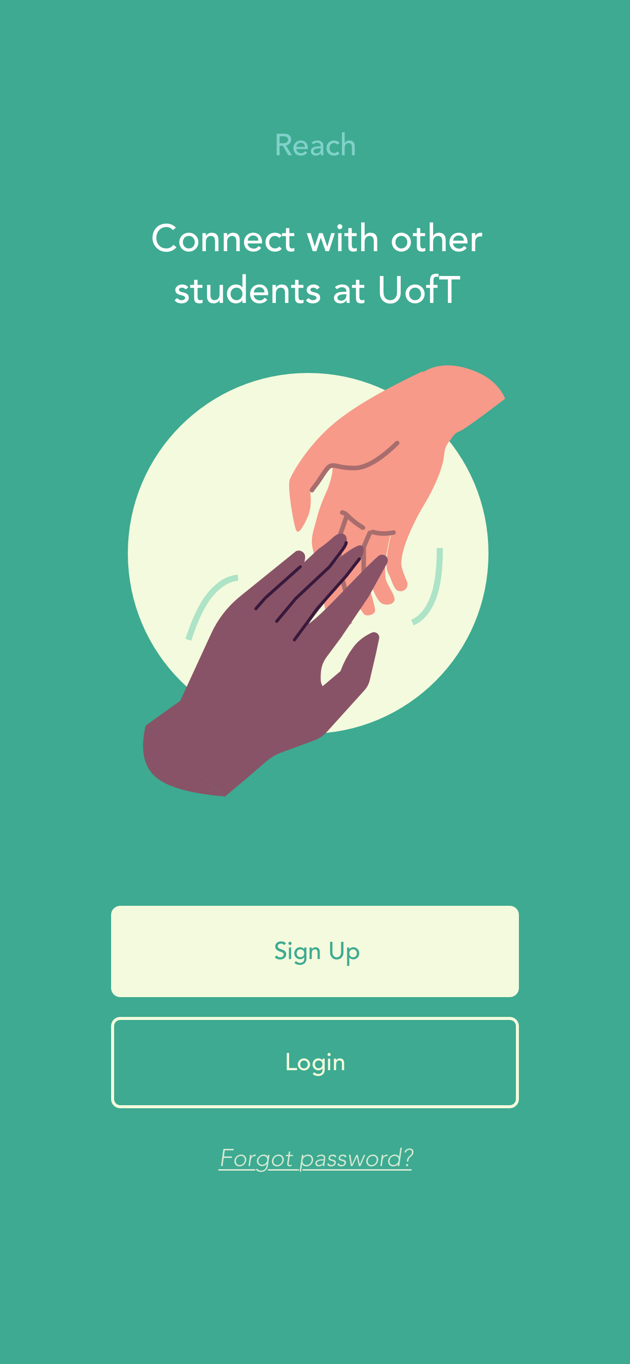
Reach - Student Mentorship Application
Ridin' Solo
User Research
Interaction Design
Prototyping
Usability Testing
3 Months
How might we design a mentorship experience for university students that will encourage experienced students to connect with new students, while considering the needs of both mentors and mentees?
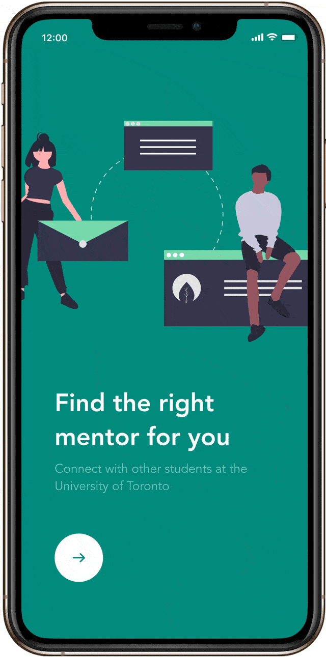
Reach, a mobile mentorship app that focuses on finding a good match based on each mentor’s expertise, experience and fit with mentees, while smoothing out the awkward social bumps.
Preface
University can be scary - it's easy to feel lost and alone for not only new students, but even current students. Mentorship is a great way to create positive relationships in the student body
My design will address the integration and quality of a mentorship experience in the entire student community. Through my research, I want to understand what a good mentorship means to both mentors and mentees, as well as the challenges they face.
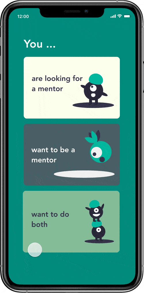
New students to campus
Students who wish to be mentors
Students who are not new, but seek mentorship
How can we create personal, intimate connections through mentorship?
How can we engage more students in the mentorship experience?
How can our design allow students to easily connect to the right people, while being inclusive
of the entire student body?
Understanding our users
To get more clarity on the mindsets and goals of mentors and mentee students, I held open-ended
interviews
with 6 mentors and mentees active in existing mentorship programs in the school.
Motivations:
Give mentorship out of feelings of altruism
Want to give back to the student community, make a positive impact
Empathize with newer students, they know how it feels and want to help them
Enjoy seeing their mentee progress
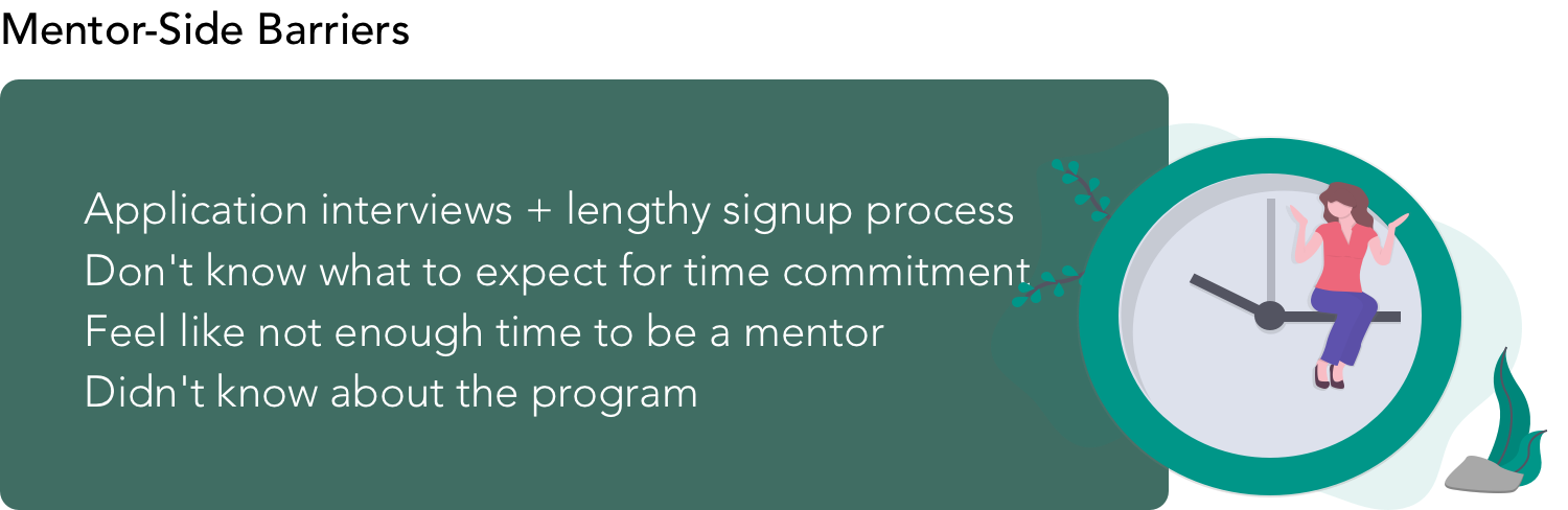
Challenges:
Really busy, and mentorship is a big time commitment with current systems
Sometimes it's not a good match with the mentees
Motivations:
Looking for a reliable source of guidance
Want to meet new people
Feeling lost/confused about university
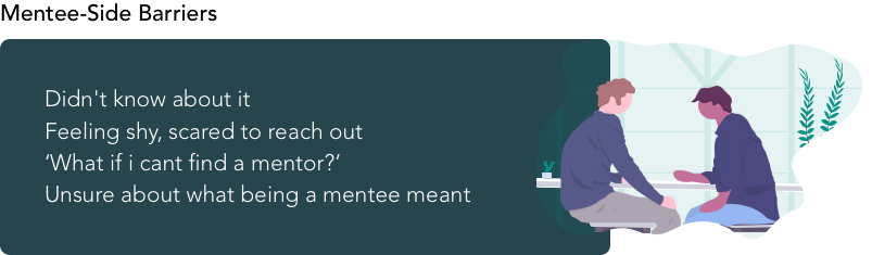
Challenges:
Sometimes mentor doesn't know how to answer their questions
Hard to align schedule
Don't feel like they really 'connected'
From the interviews, I scoped the problem space down to a core set of pain points that should be addressed in the solution.
Pain points:
Long onboarding process for mentors, filling in lots of Q&A
Hard to think of topics to mentor about
By being specific and making more detailed profiles, we can better connect the right people
together. But more details means a trade-off of time and effort - how can we streamline the
mentor onboarding process while maintaining specificity?
Pain points:
Mentor receving a lot of requests, can feel overwhelming
Mentor doesn't know which mentees they can actually give good advice to
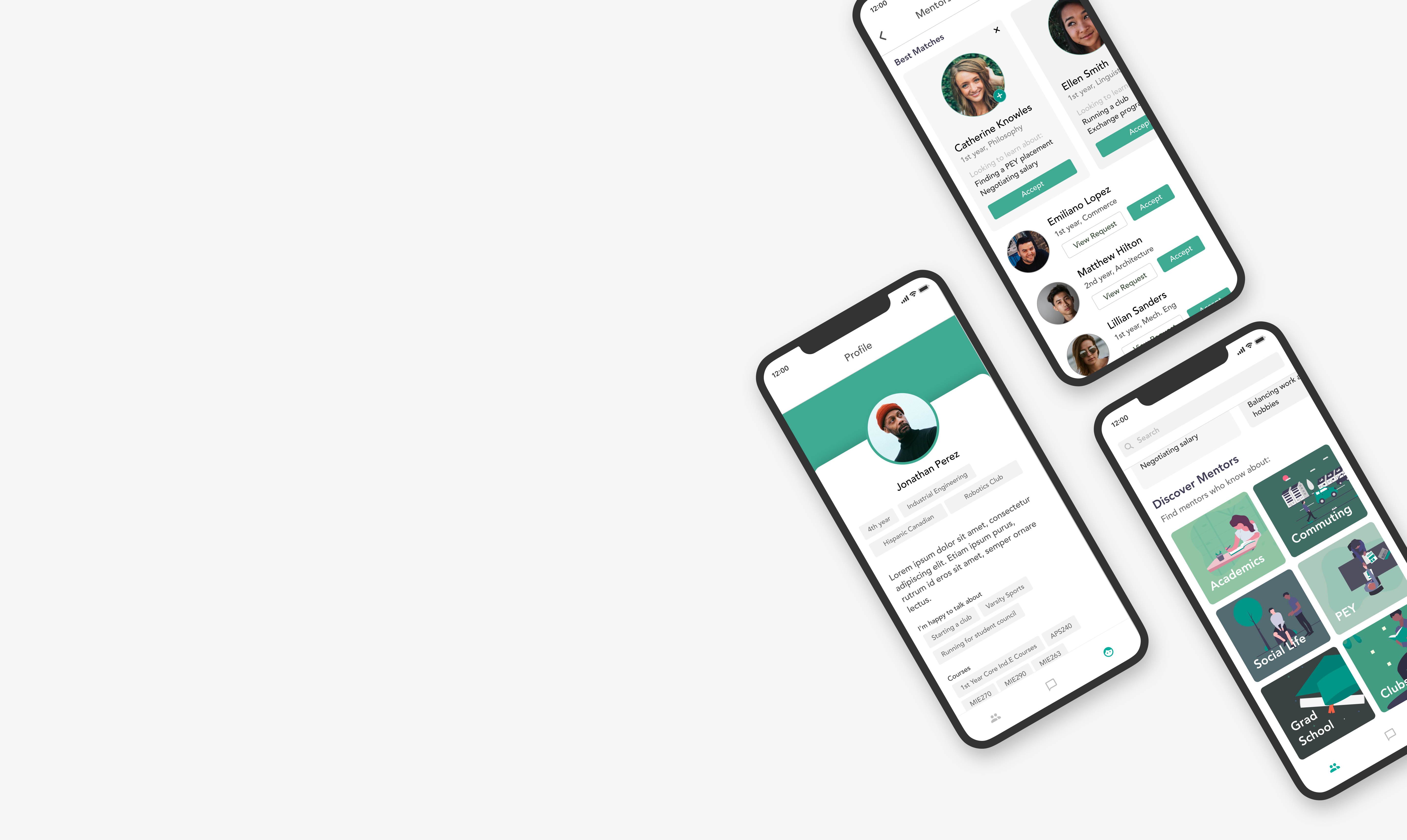
Moving forward, I fleshed out some user flows and wireframe solutions for the main issues defined.
Align with the users' mental model
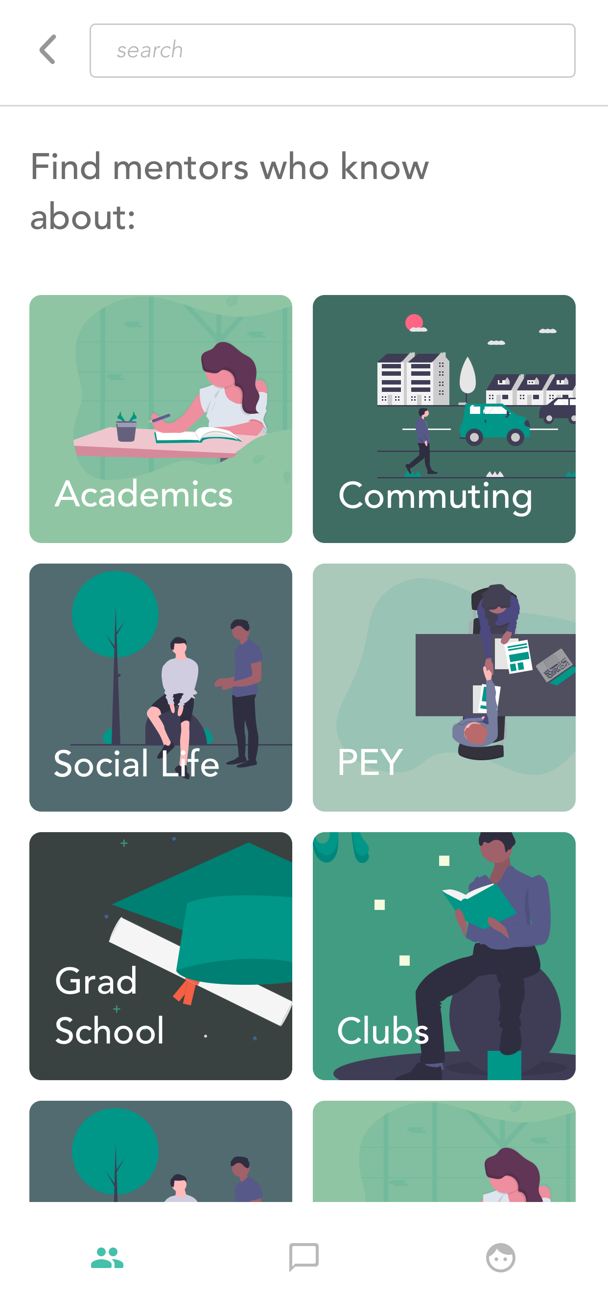
The mentor search system should align with the mental model that mentees have with regards to finding a good match.
Mentees I met with generally prioritized finding a match based on the characteristics in the following order:
- Topic Expertise (finding jobs, academics, social life, clubs)
- Demographics (year, program, cultural background)
- Hobbies and Interests
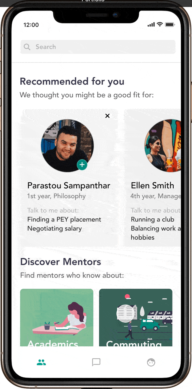
I provided two possible flows in the search system - mentees can either view mentors that are
matched algorithmically to them, or they can manually browse through mentors with specific criteria.
As a school with many international students, I believe that it's important to allow filtering by
cultural background. International students especially, report high rates of depression and
loneliness - this can help them find students who they can better relate to and connect with.
I designed a sub-topic recommendation system to suggest topics in real time based on the user's profile and what sub-topic they last tapped on.
The motivation was to lower the users' activation energy in search and to encourage exploration.
Make it easy
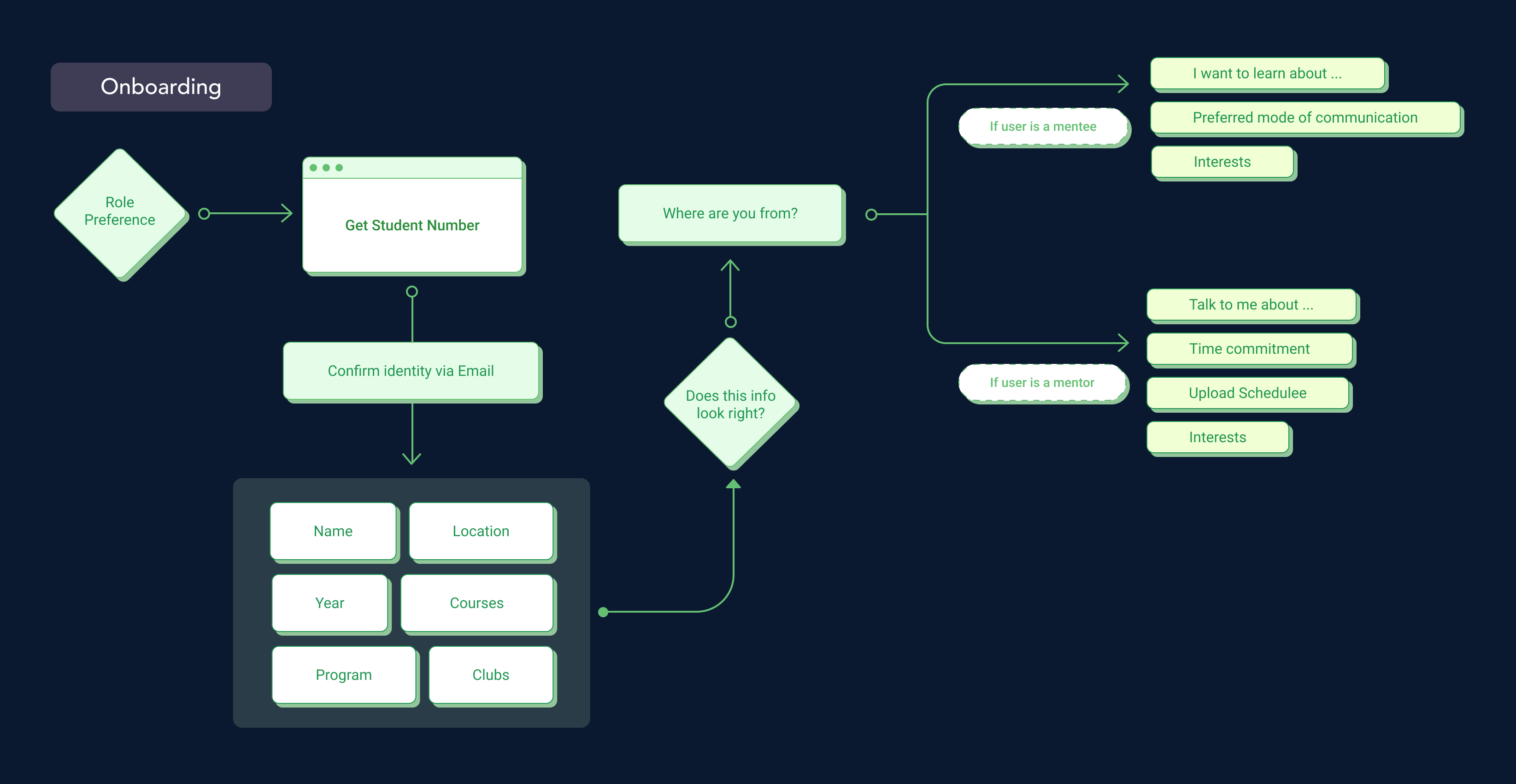
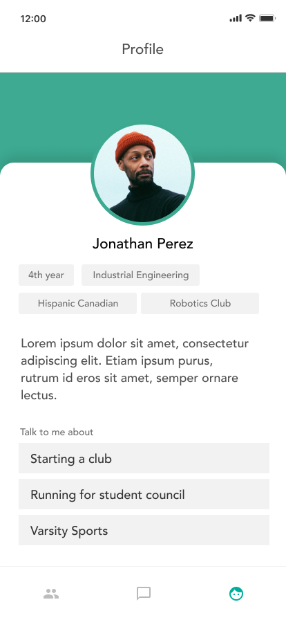
During the onboarding process, I streamlined the mentor profile writing with a few concepts.
Providing general topics as prompts
Pre-written, common experiences they can select
Writing their own experiences as a last resort
Leaving scheduling and more detailed inputs for later on
By providing topic prompts instead of just asking them to write their expertise from scratch, we're lowering the user's activation energy and also reminding them of experiences they might have not remembered otherwise. Specificity is also important in this case. It's much more useful to a mentee to see that a mentor is 'experienced in navigating group projects' rather than 'academics'.
By using the student numbers as a form of ID verification, we can automatically fill in useful data for their profile like courses taken and clubs, streamlining the onboarding process.
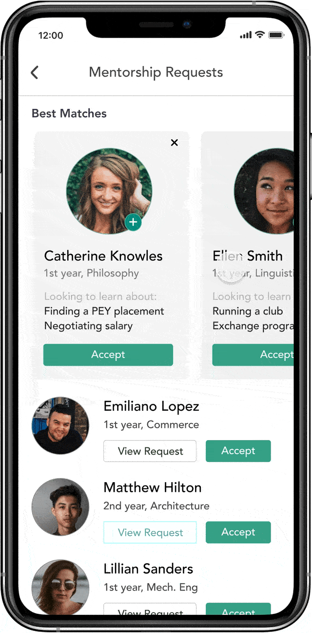
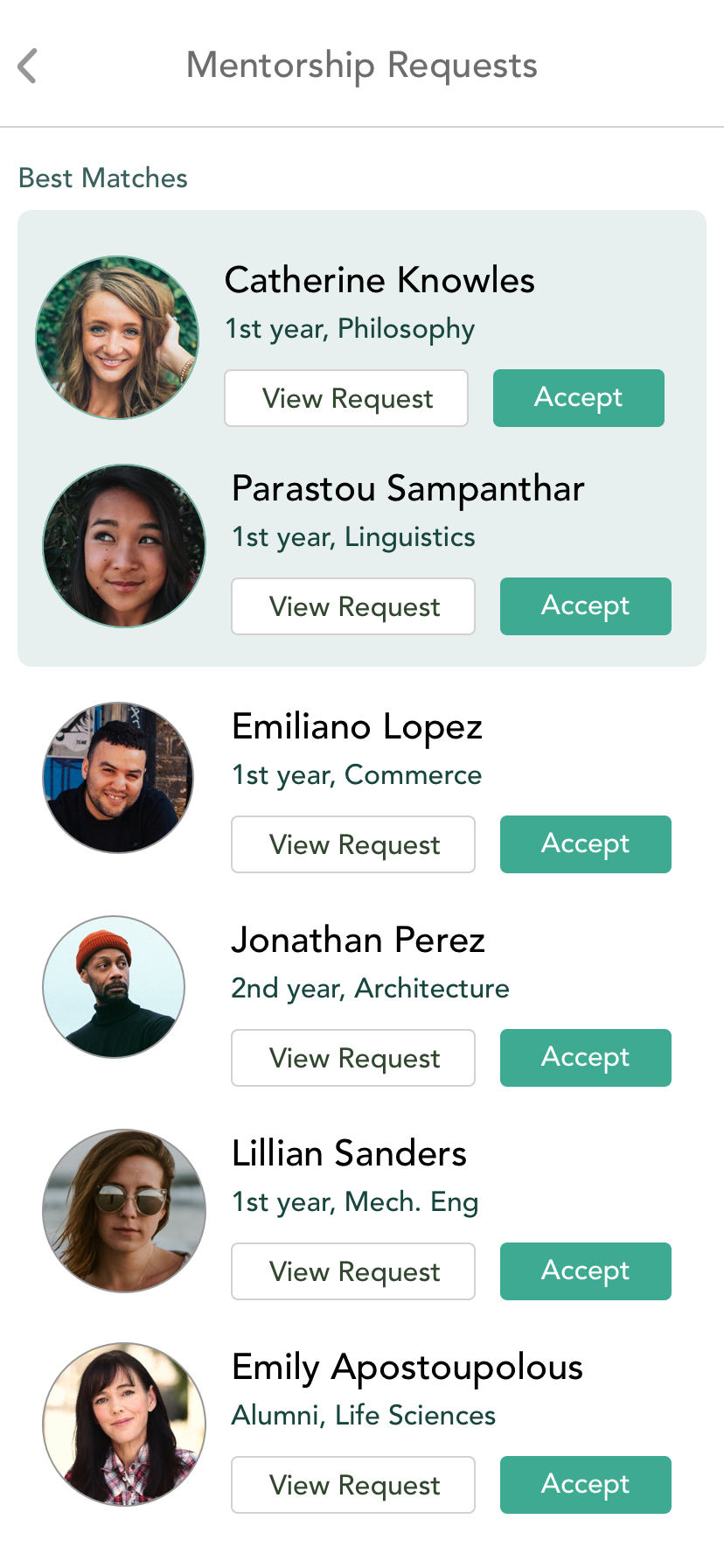
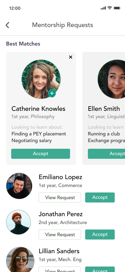
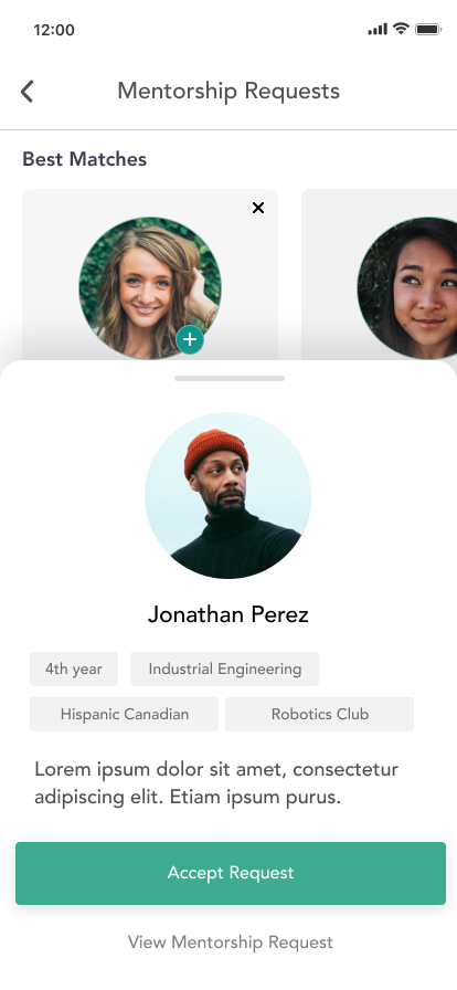
In most of the mentorship programs I saw, there were more mentees than mentors.
Mentors are dealing with a lot of mentorship requests, so
I wanted to create a request process where mentors can easily assess which requests would be the best
fit, and mentees are encouraged to send requests specifying what they want to learn from a mentor.
User flow for mentor request process
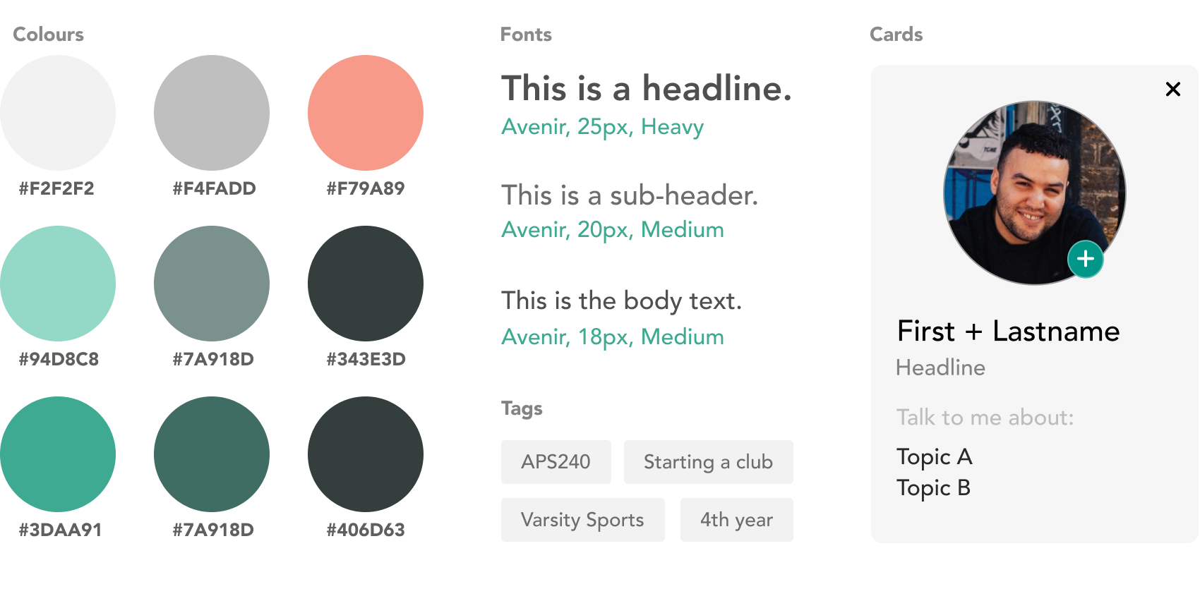
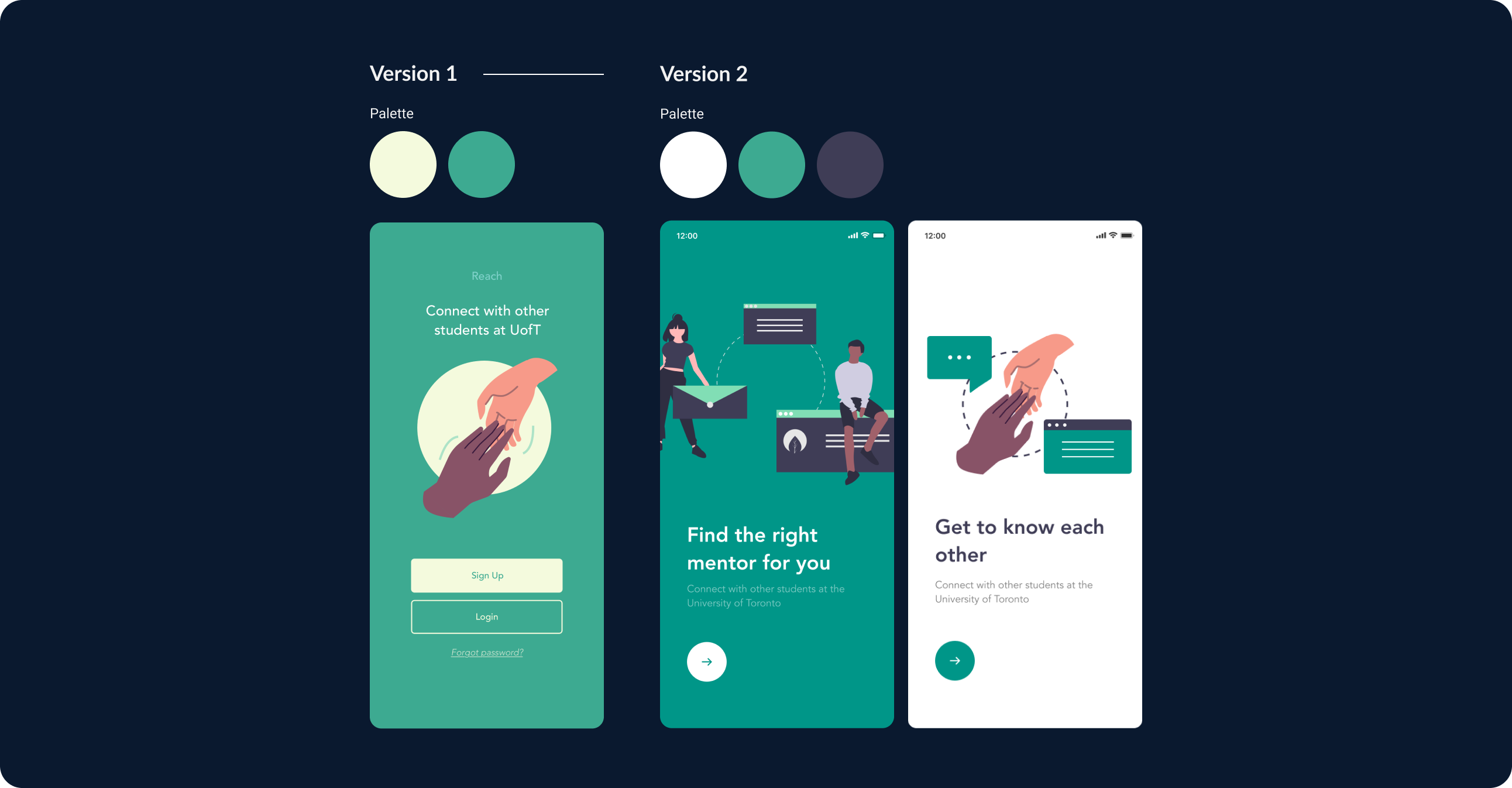
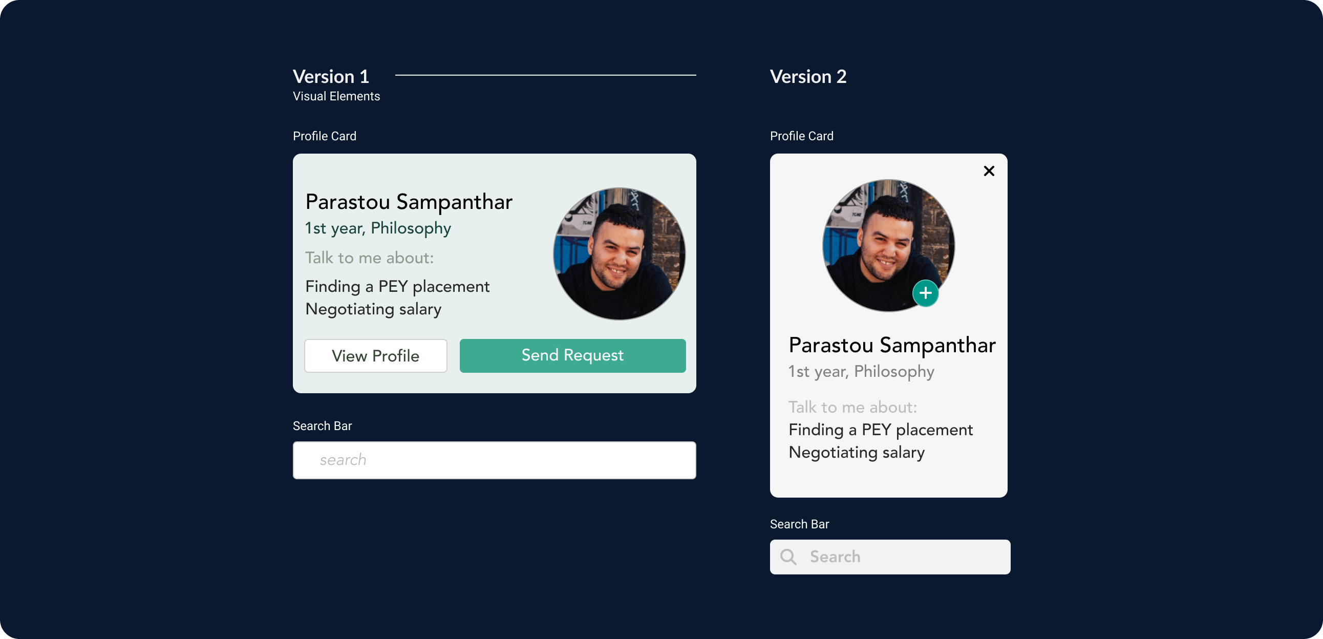
I decided to stay away from the 'social media blue' hue, and chose colours that I thought were more calm, muted and friendly.
First Iteration
The pale yellow and warm green I initally chose felt sleepy. I changed the palette to be more striking by introducing darker/lighter shades and an overall cooler tone.
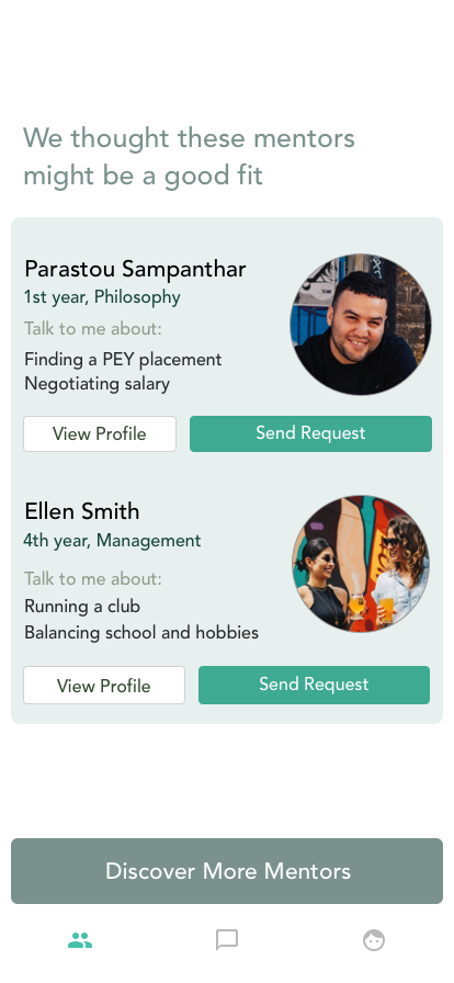
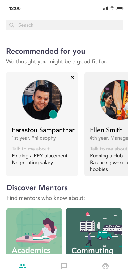
Discovering a mentor through recommendations didn’t seem significant enough to stand alone, so I combined it into the main browse page with a horizontal carousel (which also simplified the ‘Discover More Recommended Mentors’ flow).
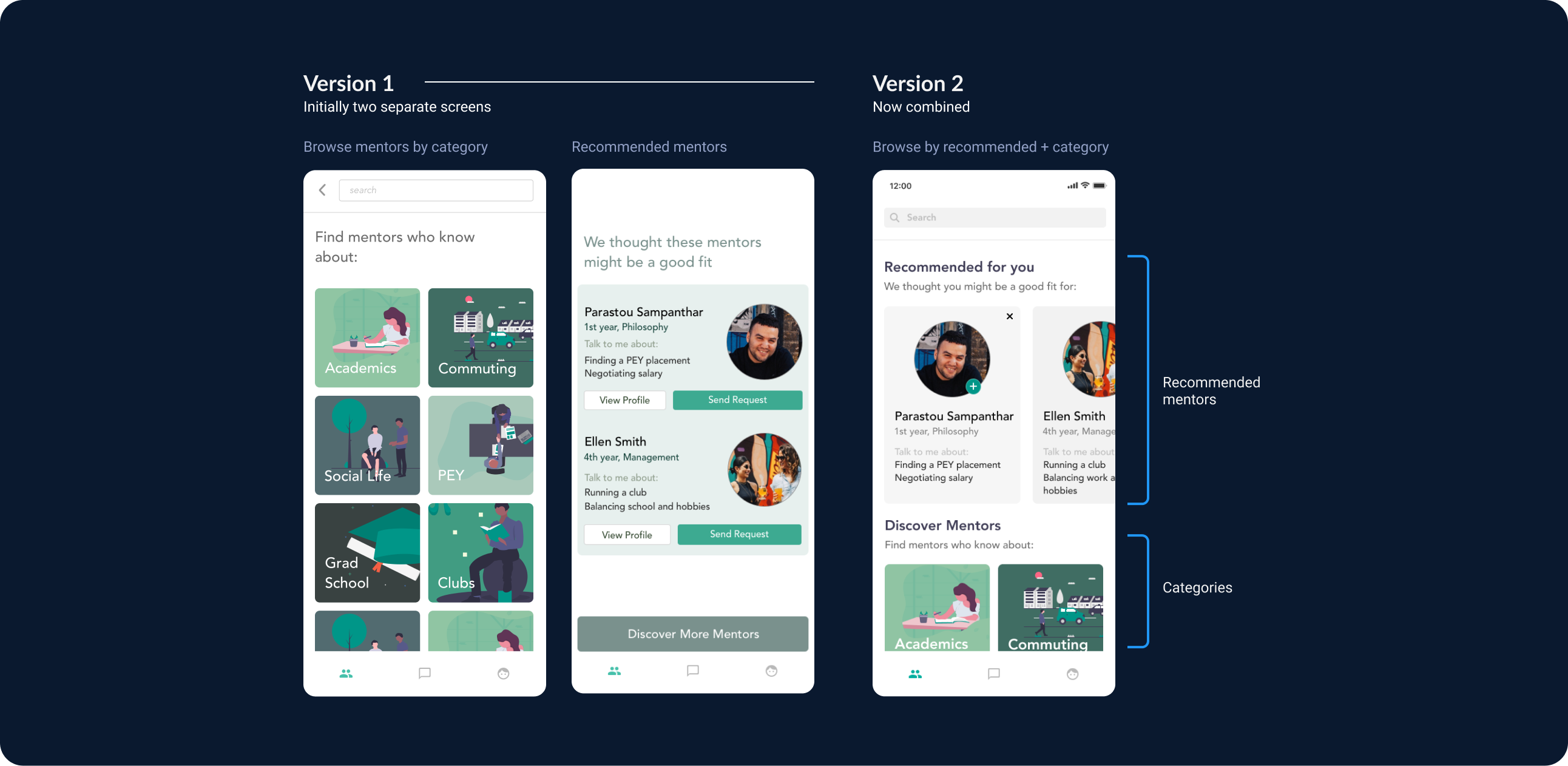
I cleaned up some of the visual elements by simplifying the actions on the card, changing the ‘Send Request’ button to a small plus icon and making the entire card tappable in lieu of the ‘View Profile’ button.
I gathered some participants to walk through some basic tasks of the app. Overall, the results were good, though some users struggled on the mentee workflow when searching in a secondary paradigm (year vs. expertise).
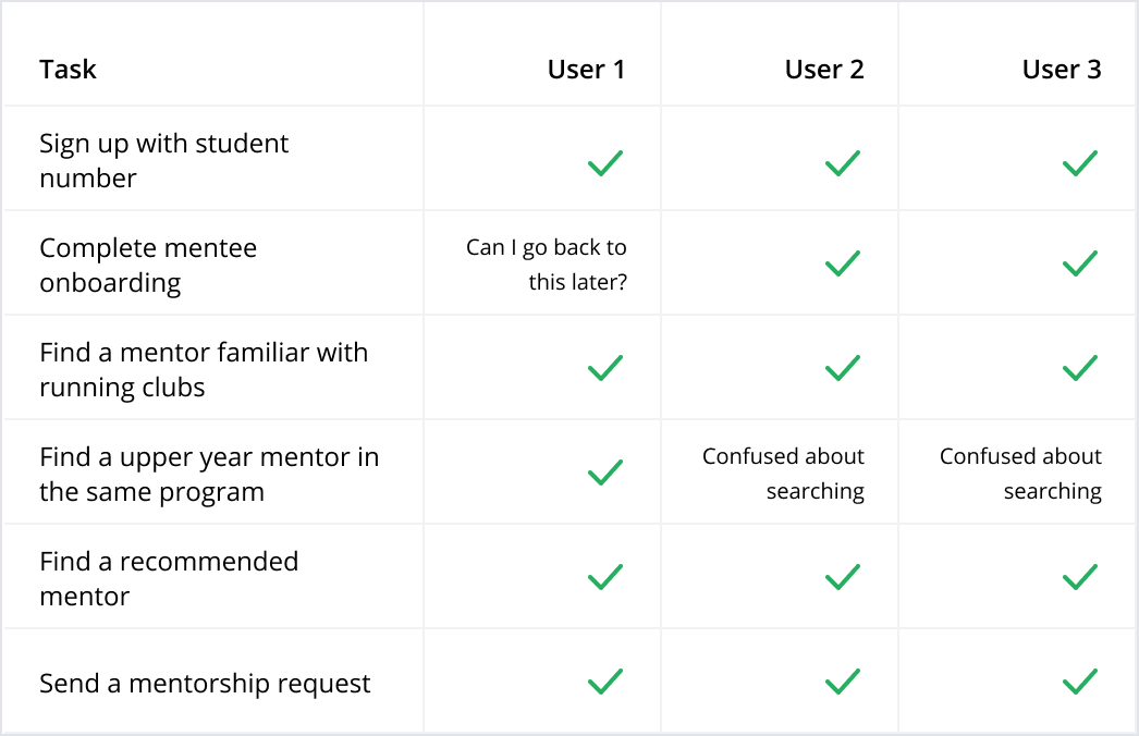
Mentee user tasks
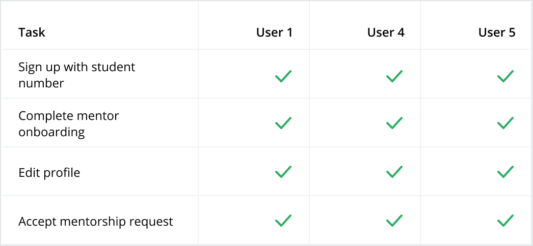
Mentor user tasks
Onwards and Upwards
From the user tests, it seemed like the app doesn't currently support multiple paradigms of search well (topic first vs. year first). I think it would be valuable to survey more students on which method they prefer, and strike a happy medium.
Since students have a fairly consistent weekly schedule, we can allow students to upload their calendars and easily pick times that work for both parties to use for mentoring
New students may have trouble finding their way around, it would be helpful to have some interactive layout of the school for picking meetup locations
Creating small groups of 3-4 mentees who have similar interests, and connecting them with one mentor. This would ease the demand and supply imbalance, while also creating more mentee-mentee connections.
Finishing thoughts
This was a challenging week; it was the first time I've tackled the design of an entire application (and had complete autonomy over too). Initially, I was a bit overwhelmed with the amount of possibilities and direction - but after reading others' case studies with challenges of a similar scope, I found that solving the major user pain points was a good way to go.
I would love to refine the visual language and develop some of the features further.